
In the world of interior design, colors play a crucial role in creating the desired ambiance and setting the overall mood of a space. As we enter 2016, new trends and color palettes are emerging, offering exciting possibilities for those looking to refresh their homes with a new look. Whether you are planning a complete overhaul or just a few updates, incorporating the right colors can make a significant impact on the overall aesthetic of your space. In this article, we will explore the top colors to start decorating with in 2016, backed by research and expert opinions.
Contents
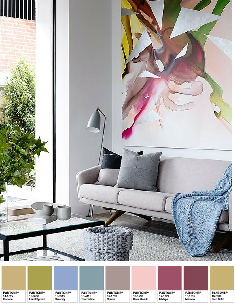
- 1 The Rise of Serenity and Rose Quartz
- 2 Neutral Tones with a Twist
- 3 Go Green with Nature-Inspired Hues
- 4 Introducing Dark and Moody Hues
- 5 The Timeless Elegance of Monochrome
- 6 The Power of Accent Colors
- 7 Incorporating Colors Based on Room Function
- 8 The Importance of Lighting
- 9 Conclusion
- 10 Frequently Asked Questions (FAQs)
- 10.1 Q1: Are Serenity and Rose Quartz suitable for any room in the house?
- 10.2 Q2: Can I incorporate more than one accent color in a room?
- 10.3 Q3: How can I incorporate nature-inspired hues into a small space?
- 10.4 Q4: Are dark and moody hues suitable for a well-lit room?
- 10.5 Q5: How can I create a cohesive look with a monochrome color scheme?
- 11 Summary
- 12 Related video of These Are The Colors To Start Decorating With In 2016
The Rise of Serenity and Rose Quartz
Each year, prominent color authorities such as Pantone release their color selections for the year ahead. In 2016, Pantone declared Serenity and Rose Quartz as the co-colors of the year. Serenity, a tranquil blue, and Rose Quartz, a soft and delicate pink, were chosen to reflect a sense of calm and balance, amidst the chaos of the modern world.
These colors can be incorporated into your home decor in various ways. For instance, painting a feature wall in Serenity can create a serene backdrop for a living room or bedroom. Pairing Rose Quartz accents, such as throw pillows or curtains, with neutral furniture can add a touch of elegance and femininity to any space.
Neutral Tones with a Twist
Neutral colors are timeless and versatile, providing a clean canvas for other design elements to shine. In 2016, however, there is a shift towards incorporating neutral tones with a twist. Instead of relying solely on beige and white, designers are embracing warmer neutrals such as greige (a combination of gray and beige) and taupe.
These warmer neutrals add depth and richness to a space while maintaining a sense of sophistication. Pairing greige walls with dark wood furniture and pops of color in accessories can create a modern and inviting atmosphere. Similarly, using taupe as a base color and layering different shades of taupe in textiles and decor can add dimension and interest to a room.
Go Green with Nature-Inspired Hues
As sustainability and eco-consciousness continue to gain importance, nature-inspired hues are becoming increasingly popular in interior design. Green, in particular, is being seen as a versatile and calming color choice that brings the outdoors inside.
Various shades of green, such as emerald, moss, and sage, can be incorporated into your home decor to create a fresh and inviting atmosphere. For instance, painting kitchen cabinets in a deep emerald green can add a touch of luxury and create a focal point in the room. Adding pops of moss or sage green in upholstery, artwork, or accessories can bring a sense of tranquility and connection to nature.
Introducing Dark and Moody Hues
In contrast to the popular notion that lighter colors make a space feel bigger and brighter, dark and moody hues are gaining traction in 2016. Deep blues, charcoal grays, and rich blacks are being used to create dramatic and sophisticated interiors.
When incorporating dark colors into your decor, it’s essential to strike a balance to avoid making the space feel too heavy or oppressive. Pairing deep blue walls with light-colored furniture and accessories can create a sense of contrast and balance. Adding metallic accents, such as gold or copper, can further enhance the luxurious feel of a dark and moody space.
The Timeless Elegance of Monochrome
Monochrome color schemes, featuring varying shades of a single color, have stood the test of time and continue to be a popular choice in 2016. Whether it’s all shades of gray, different tones of blue, or variations of beige, monochrome palettes offer a timeless and elegant look.
Incorporating a monochrome color scheme can be as simple as choosing furniture and decor in different shades of the same color family. For example, pairing light and dark gray furniture with textured gray wallpaper can create a sophisticated and cohesive look in a living room or bedroom. To add visual interest, incorporate different textures and patterns within the same color family.
The Power of Accent Colors
While the overall color scheme sets the foundation for your space, accent colors play a crucial role in adding personality and visual interest. In 2016, there is a shift towards incorporating bold and vibrant accent colors to create focal points and inject energy into a room.
For example, a predominantly neutral living room can be instantly transformed by adding a vibrant orange accent wall or a bold yellow armchair. These pops of color create a sense of excitement and can be easily changed or updated as trends evolve.
Incorporating Colors Based on Room Function
When selecting colors for your home decor, it’s essential to consider the function of each room. Different colors evoke various moods and emotions, making them more suitable for specific spaces.
For instance, cool colors such as blues and greens are known to promote relaxation and are ideal for bedrooms and bathrooms. Warm colors like reds and oranges, on the other hand, create a sense of energy and are well-suited for living rooms and dining areas. Understanding the psychology of color can help you create spaces that are not only aesthetically pleasing but also supportive of the room’s purpose.
The Importance of Lighting
When considering colors for your home decor, it’s crucial to keep lighting in mind. Different types of lighting can significantly impact how colors appear in a space.
Natural light, for example, can enhance the vibrancy of colors and bring out their true tones. If your space receives ample natural light, you can experiment with bolder and brighter colors. On the other hand, artificial lighting, such as warm or cool-toned LED bulbs, can alter the appearance of colors. It’s essential to test colors under different lighting conditions to ensure they achieve the desired effect.
Conclusion
As we venture into 2016, the world of interior design is ripe with exciting color trends to incorporate into your home decor. From the calming and balanced Serenity and Rose Quartz to the dramatic and moody dark hues, there is a wide range of colors to choose from based on your personal style and preferences. By understanding the psychology of color and considering the function of each room, you can create a space that reflects your personality while providing a visually pleasing and comfortable environment.
Frequently Asked Questions (FAQs)
Q1: Are Serenity and Rose Quartz suitable for any room in the house?
A1: Serenity and Rose Quartz can be used in various rooms, depending on the desired ambiance. They work particularly well in bedrooms, living rooms, and bathrooms, where a sense of calm and tranquility is desired.
Q2: Can I incorporate more than one accent color in a room?
A2: Yes, you can incorporate multiple accent colors in a room to create visual interest. However, it’s essential to strike a balance and ensure the colors complement each other and the overall color scheme.
Q3: How can I incorporate nature-inspired hues into a small space?
A3: In a small space, you can incorporate nature-inspired hues through accessories such as artwork, throw pillows, or small potted plants. These elements can add a touch of greenery and freshness without overwhelming the space.
Q4: Are dark and moody hues suitable for a well-lit room?
A4: Dark and moody hues can work well in a well-lit room, as long as there is a balance with lighter elements such as furniture or accessories. The contrast between light and dark can create a striking and sophisticated look.
Q5: How can I create a cohesive look with a monochrome color scheme?
A5: To create a cohesive look with a monochrome color scheme, vary the shades and textures within the same color family. Incorporate different materials and patterns to add visual interest while maintaining a unified aesthetic.
Summary
In 2016, the world of interior design is embracing a range of colors to create unique and inspiring spaces. From the calming Serenity and Rose Quartz to the dramatic dark hues, there is a color palette for every style and preference. Incorporating warmer neutrals, nature-inspired greens, and monochrome schemes adds depth and elegance to any room. Accent colors inject energy and personality, while considering the function of each room ensures the colors align with the desired mood. By understanding the impact of lighting and experimenting with different hues, you can create a space that is visually pleasing and reflective of your individuality.